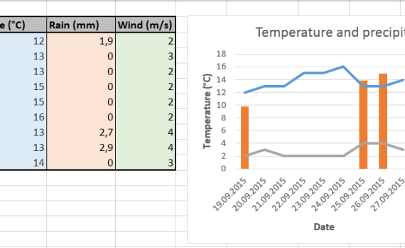
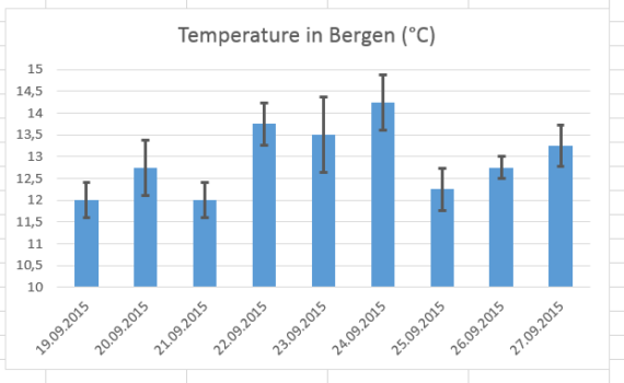
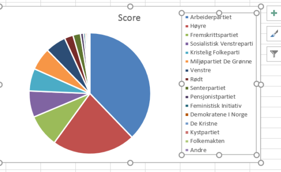
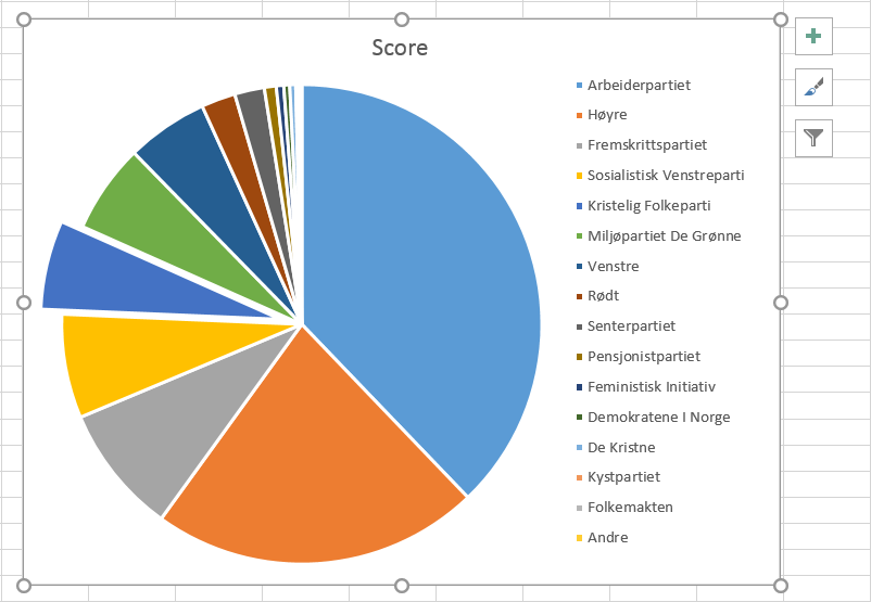
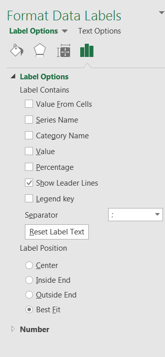
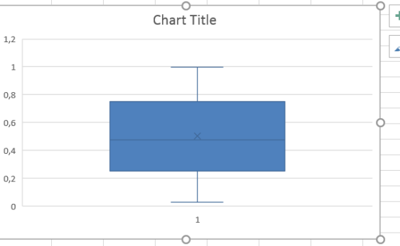
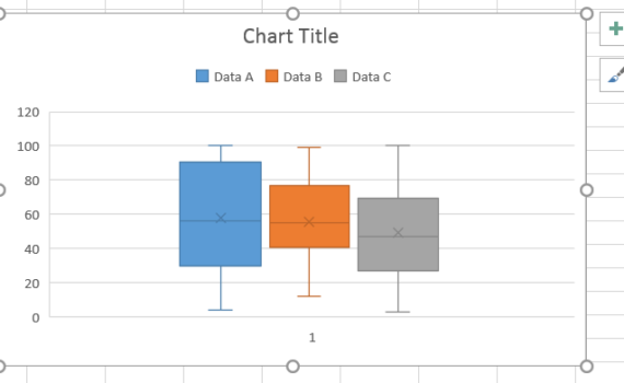
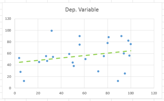
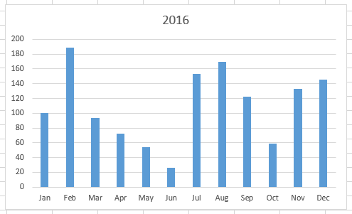
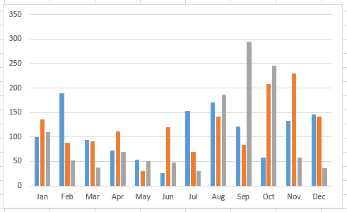
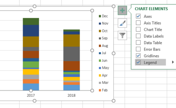
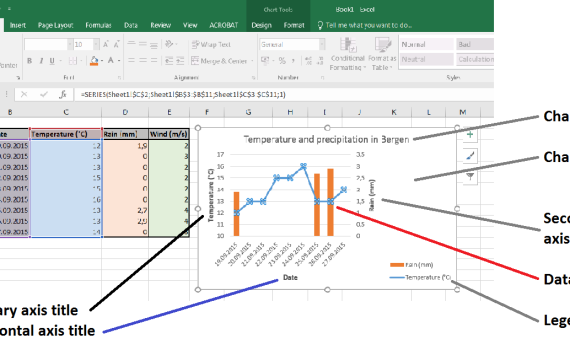
Excel16 -3- Figures and graphs

Creating a graph or a figure in MS Excel isn’t very complicated… as long as you have an idea of how the result should look like. Do you want to create a histogram? a bar graph? a pie chart? a scatter plot? Will you have one or several datasets to show in this graph? Will you need a secondary Y-axis? error bars? labels? Let’s see that step-by-step.


It is not so often that one gets to use a pie chart… and it is not so often that such a chart is used for the right purpose. Pie charts can be used to represent different categories of a population, polls, data referring on proportions and percentage. Let’s learn how to make […]

11. Make a pie chart


You may realize, looking at the pie chart that we just made previously, that the design of the chart area is rather inadequate. The chart itself is ridiculously small compared to the legend. This is essentially due to a default setting that MS Excel uses and which restricts the size/position of the […]

12. Resize the legend box